Juta Arkitekter
Brand Identity / Logo Design / Website Design
Services
Year
2024
Juta Arkitekter
Client
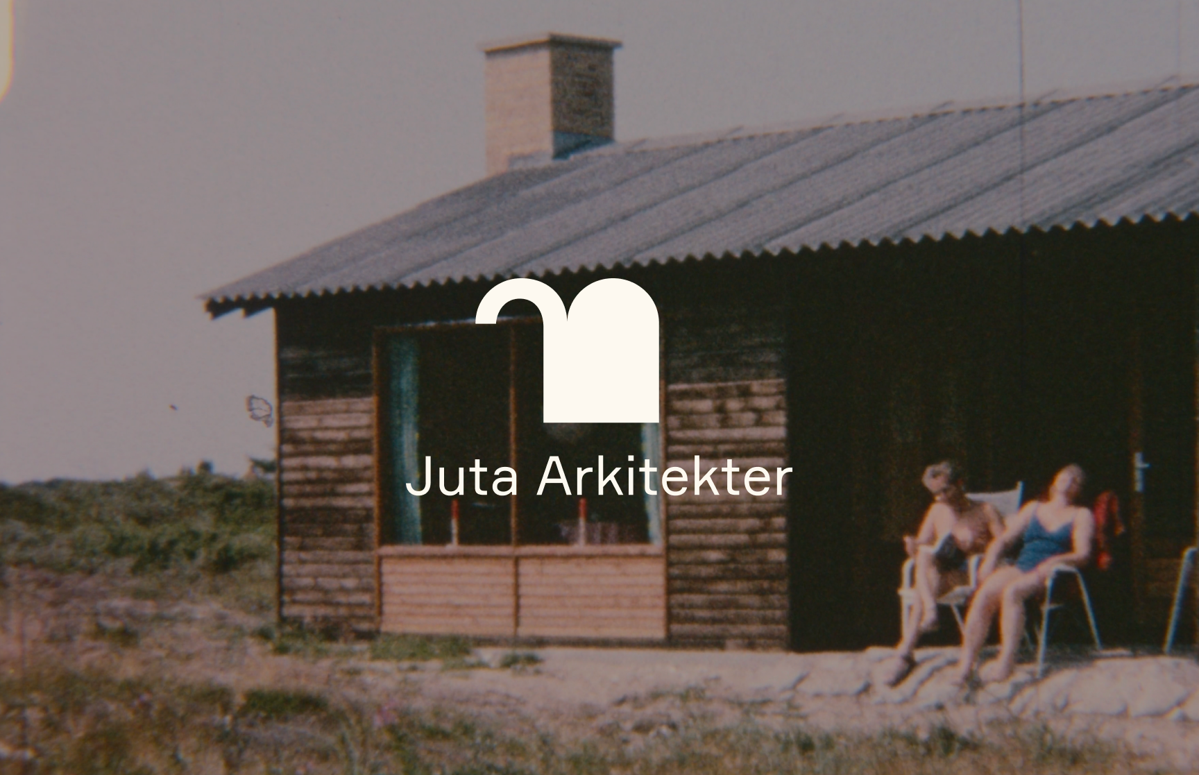
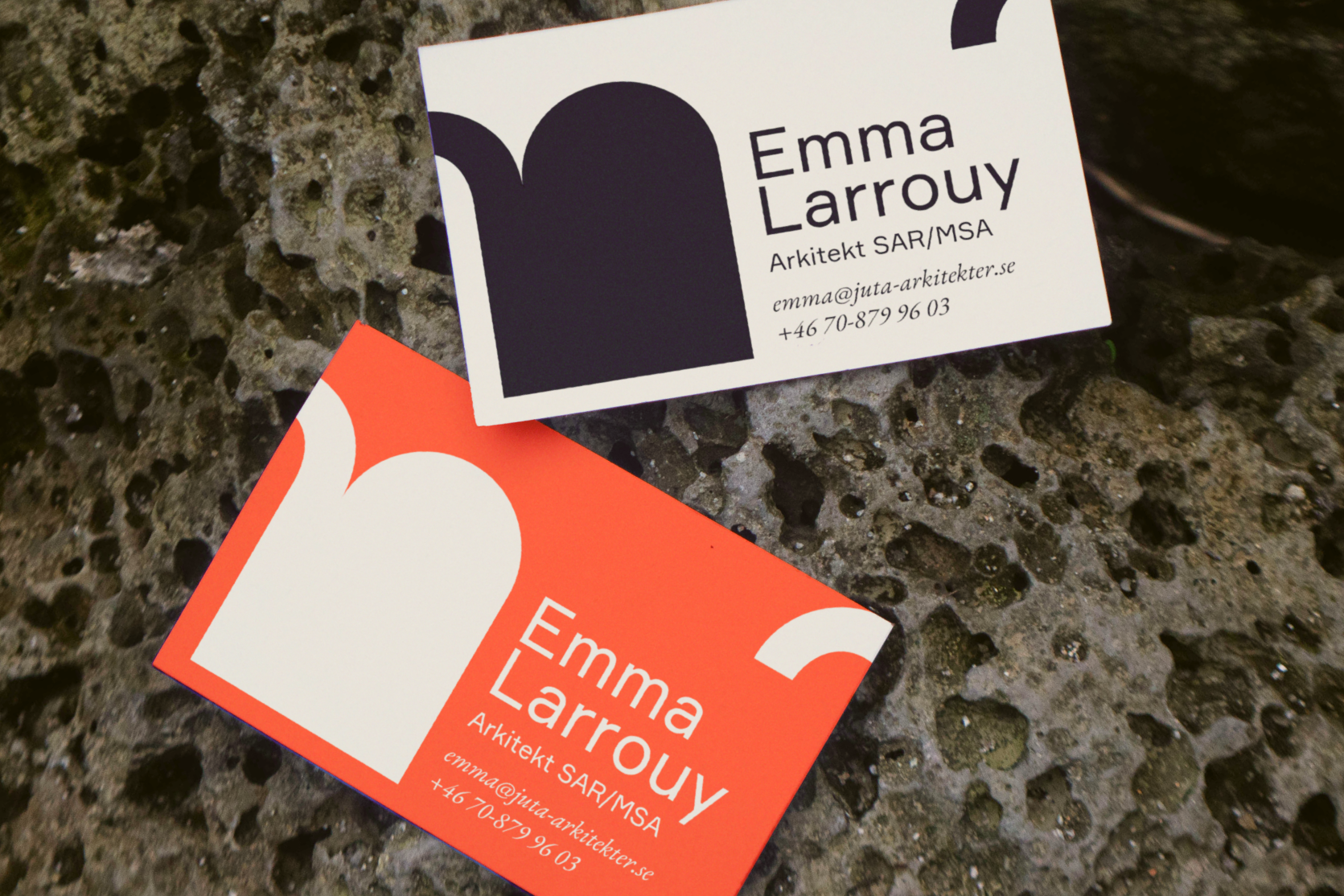
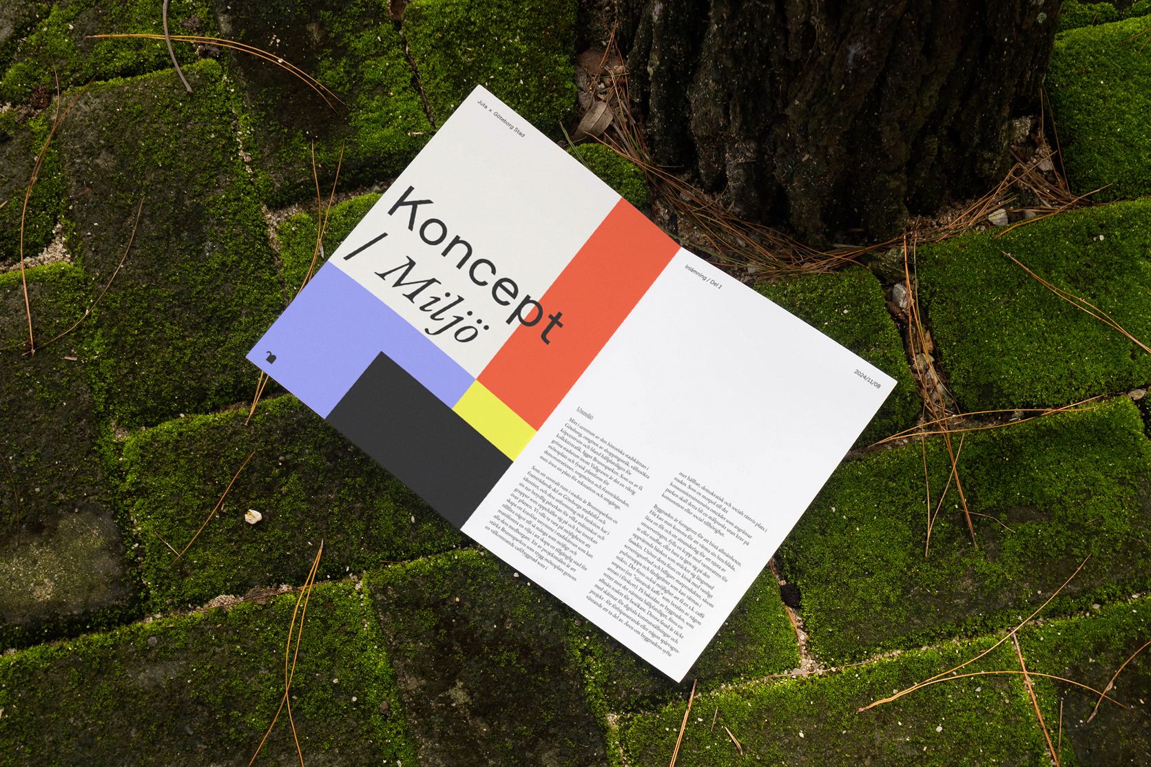
This architecture studio wanted a brand that reflected their lively and unconventional approach, rather than the typical black-and-white minimalism of architecture. The result is a bold, colourful and flexible identity that can both take center stage or step back and let the work speak for itself.
The logo consisting of a J and U turned on it’s head represents an open door. However, it is also quite alike an elephant – which Juta simply found funny. More elephant-doors in architecture!